Mips
Revamped Mips digital presence with a scalable, flexible platform, enhancing brand identity and investor relations. Nominated for Svenska designpriset.
What I did
Frontend development & art directionTechnologies used
WordPress, PHP, HTML, CSS, JavaScriptTimeline
2020 - 2022Project Overview
When I was at Bazooka, one of the most exciting projects I worked on was for Mips, a company known for its helmet safety technology in the sports, motorcycling, and safety industries.
The project kicked off in the fall of 2020, and our goal was to give Mips a digital presence that truly reflected the innovative safety features of their products.
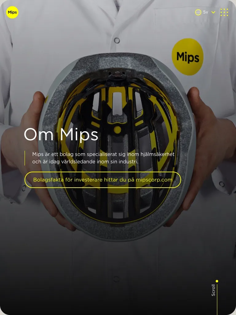
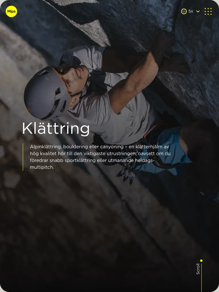
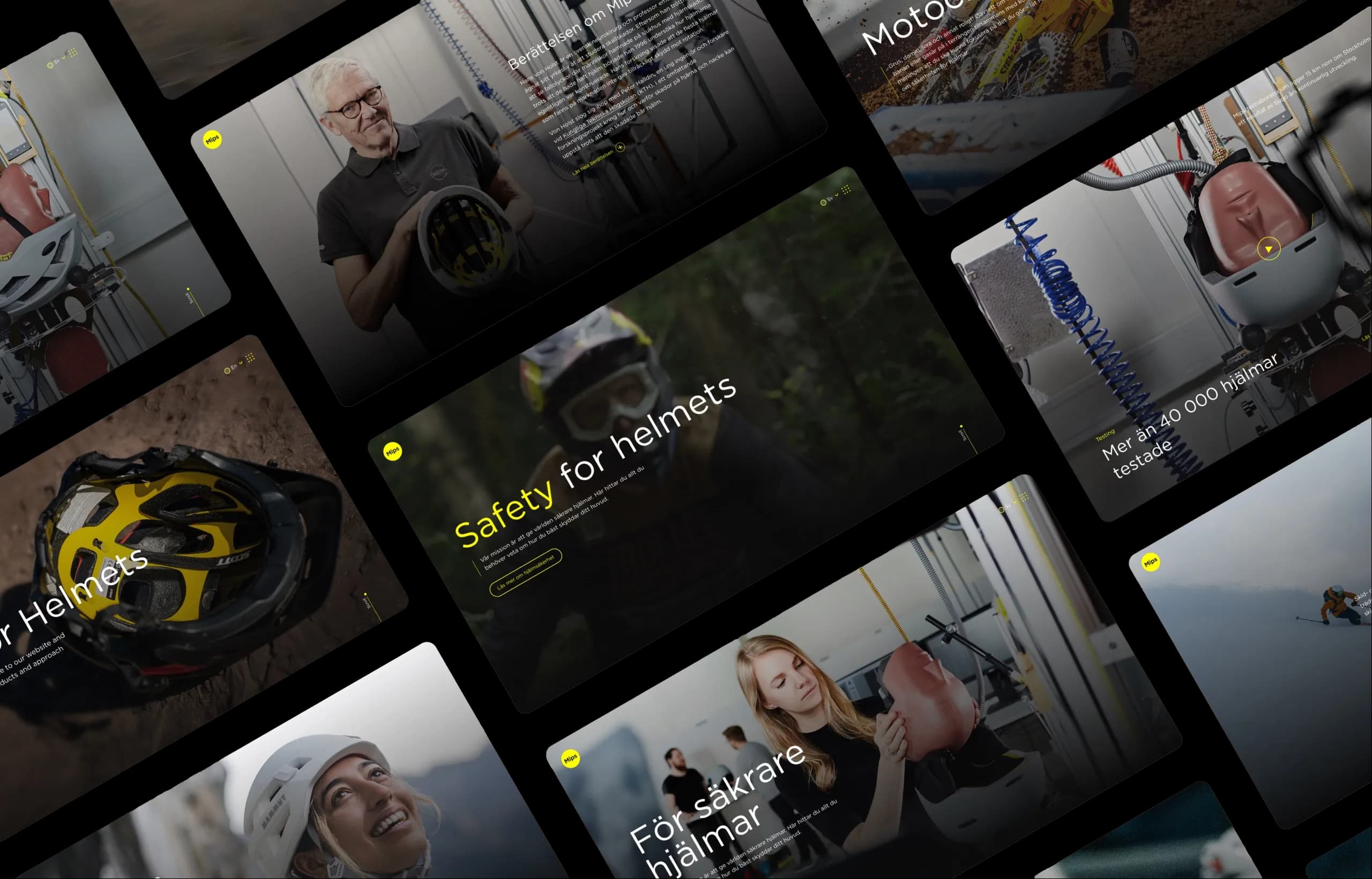
Role and Responsibilities
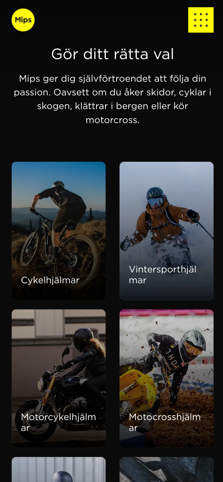
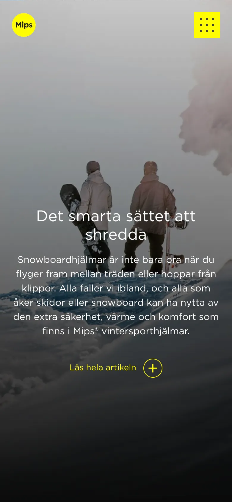
As the Art Director and Front-End Developer, I had a hands-on role from the start, working with a talented team to redesign and upgrade their consumer website. We had to align the new site with Mips' updated brand platform, focusing not just on aesthetics but also on delivering the right tone to connect with their customers. It wasn't just about looking good; it was about educating people on the crucial safety features that set Mips' helmets apart.
Scalable and Flexible Platform
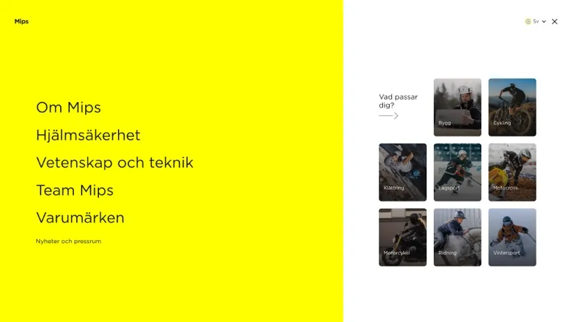
A major part of our solution was to ensure the website could grow and evolve. We created a scalable platform that could be reused across multiple websites, which was a big win for production efficiency. The platform allowed functionality to be switched on and off depending on the site's purpose, and we built it in a way that made it easy to add new languages post-launch. This meant that Mips could focus on their primary markets first without sacrificing accessibility for future ones.


Technologies We Used
To bring the project to life, we relied on a solid stack of technologies. The core of the site was built on WordPress, which gave the client the flexibility they needed to manage content post-launch. On the front-end, I worked extensively with HTML, CSS, and JavaScript to ensure that the design was both visually appealing and responsive across all devices. We also used PHP for back-end development and to handle server-side logic. To streamline the template structure and enhance flexibility, we integrated Twig, which helped us create cleaner and more maintainable code. This combination allowed us to deliver a site that was not only beautifully designed but also robust and easy to maintain.
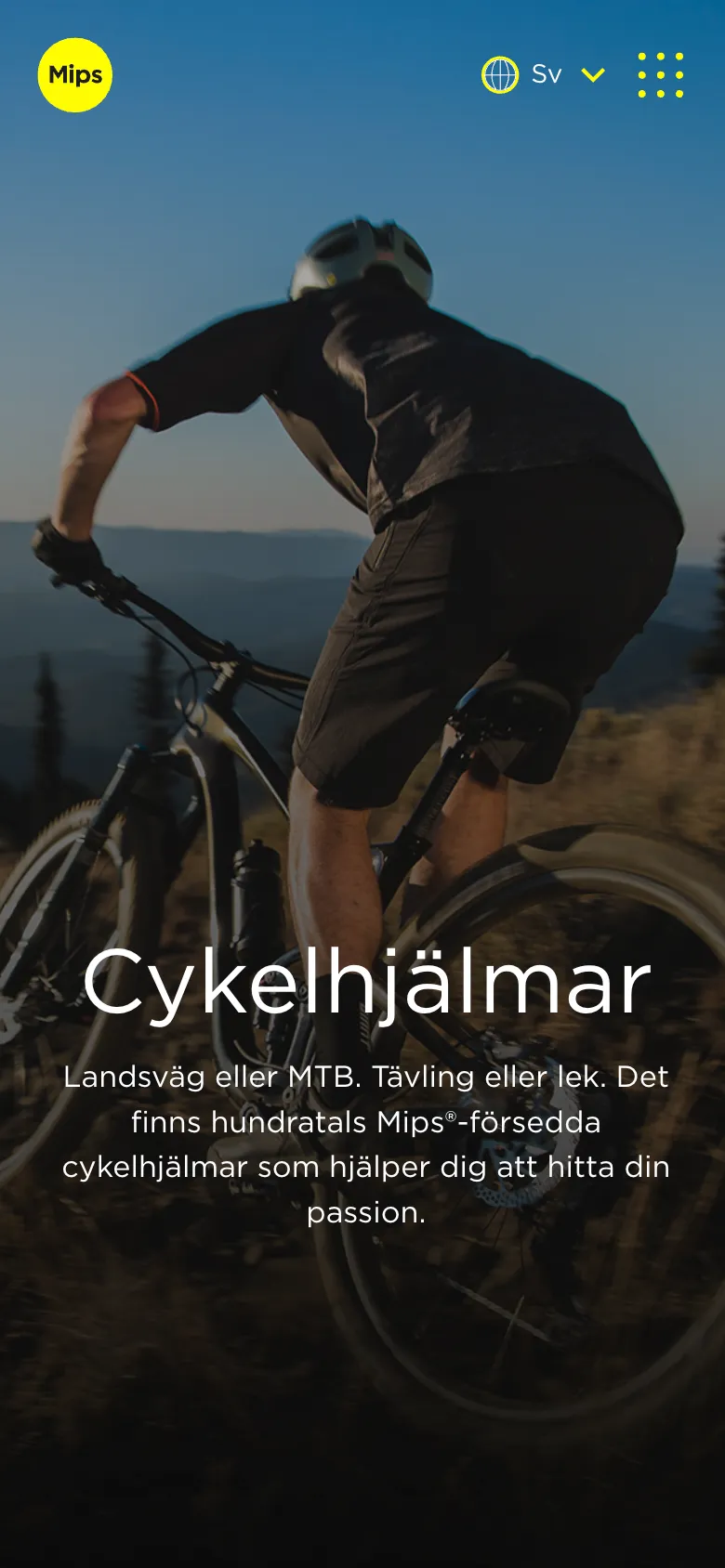
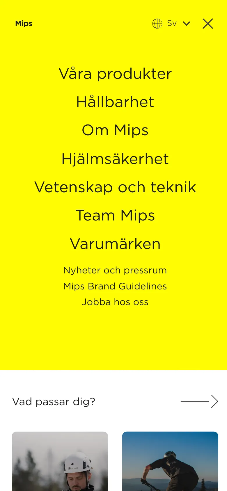
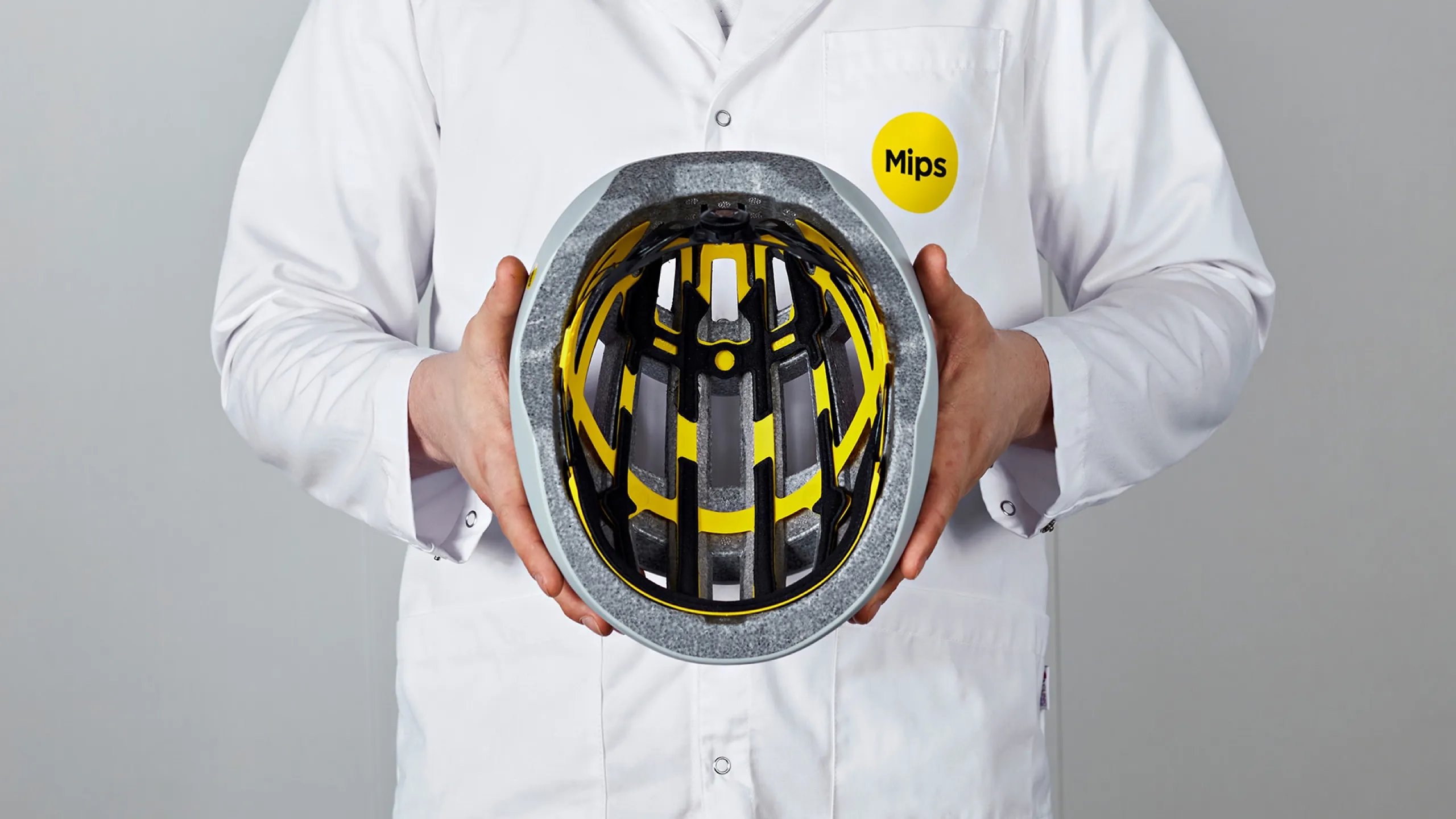
The yellow Mips circle is an important identity-bearing symbol that maintains a yellow thread throughout the entire website.
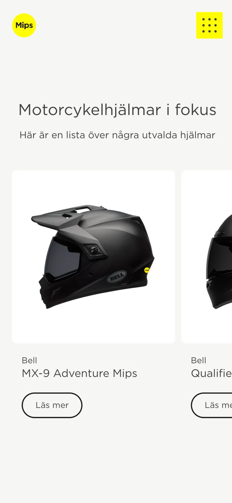
Investor Relations Website
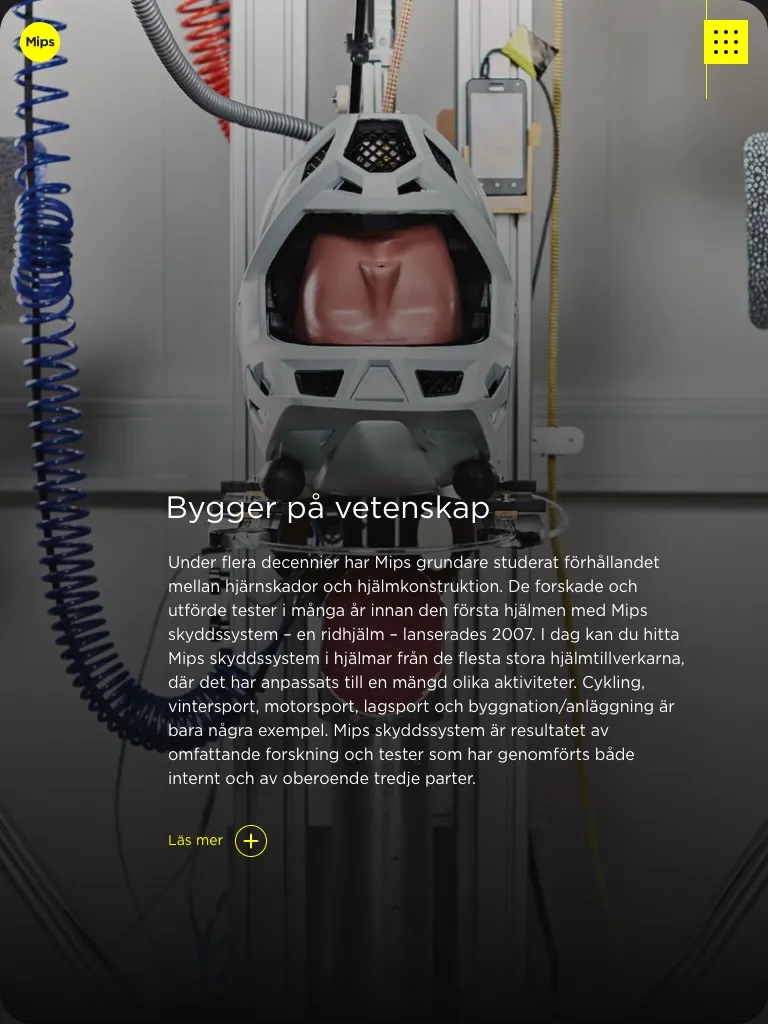
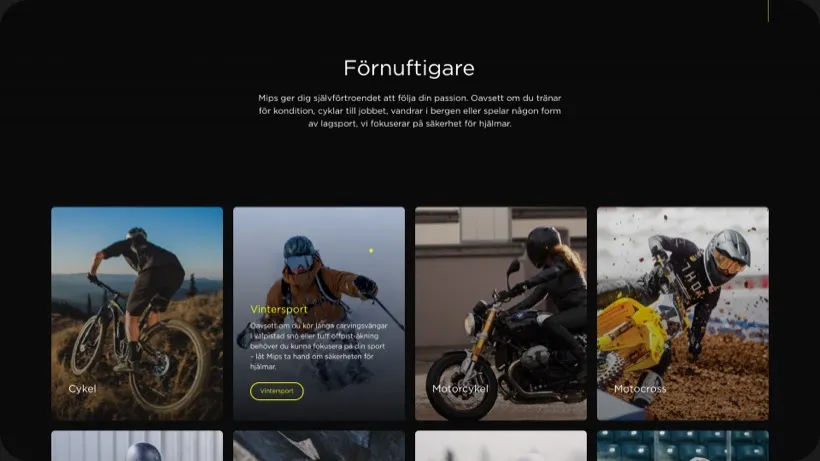
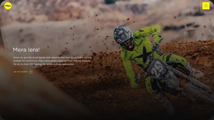
In the second phase of the project, we turned our attention to their investor relations website, Mipscorp.com. This site was designed to give investors a deep dive into Mips' international achievements, complete with annual reports, presentations, and stock data integrated via Modular Finance. I loved how we incorporated design details like the signature yellow Mips circle—it's a bold visual identity that's used throughout the site, giving it a consistent look that ties back to the brand's core.
Comprehensive Team Effort
Our team didn't just stop at web design and development. We also handled UX design, motion design, content support, and more. It was a real team effort, and the work was recognized when we were nominated for the Swedish Design Prize in the Information Digital category. Seeing that recognition was such a rewarding moment.